

When it comes to decorating, you know that different shades can have a major impact on the overall design of your space. And, although we wouldn’t blame you for wanting to go all-out in the paint department when it comes to your first painting colours choice since it is bound to be your most prominent shade, there are many other ways to incorporate an underrated hue such as burgundy without overdoing it. We’ll walk you through several tips and tricks that will show you how to subtly add a tasty touch of burgundy throughout your space and explore various ways in which this shade deserves a spot on your color palette.
Burgundy + Lapis
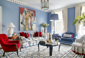
Lapis and burgundy are classic color combinations. When used together in slightly different shades, white acts as the perfect backdrop to make this duo even more striking.
Burgundy + Charcoal: Moody & Impactful

A dramatic accent wall can not only give a room a cool vibe, but it can also be a very cost-effective way to update your décor. Bold, unexpected color adds an element of surprise to space and can be just the thing to liven up a room design. These drapes bring a sense of drama with their burgundy hue but soften the room with warm, creamy tones and patterns. Paired with charcoal details, it’s the perfect combination for a grown-up space.
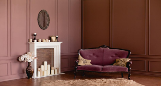
Burgundy + Black: Dramatic & Inviting
Black and burgundy painting colours are dramatic color combination, but the rich burgundy upholstery and textured walls create a warm and welcoming feeling for your home.
Burgundy + Purple:

Cool & Regal
You absolutely cannot go wrong with this neutral purple rug paired with soft burgundy walls. The rich color of the rug really enhances the warmth of the burgundy wall color while breaking it up and providing a nice change of pace in your sleeping space.
Burgundy + Ivory: Calm & Neutral

Burgundy is known as a “cold” color, so if you want to keep things calm and collected, it’s best to pair one with a neutral tone that’s closer to a “warm” hue. Choose a classic warm ivory hue that complements the more dramatic hue without competing with it. By using neutral shadesp ainting colours in other stylized areas of the home—say, on throw pillow covers—it’s easy to add another dimension to the room without adding too much contrast.
Burgundy + Orange: Punchy & Bright
When you’re designing with this dynamic duo, the hard part is deciding which one to use for your focal piece. but not in equal measure. Use both colors but not in equal measure It’s all about color ratios, and in here aubergine rules…but just barely. The fun part is that this room feels sophisticated while also looking inviting, thanks to the warm orange tones on the couch and along the wall. This makes burgundy feel more like a neutral than it would on its own.
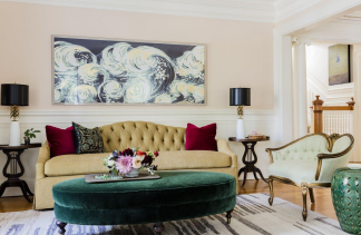
Burgundy + Red: Welcoming & Warm
When you choose colors for your home, stick to hues that are the same or closely related to one another on the color wheel. A pretty palette of soft neutrals makes this living room the perfect
backdrop for punches of red accent color. The graphic floral print on the sofa, cushions, chair, and bolsters is a bold choice that’s made even more stunning.
Burgundy + Blush: Soft & Sweet
Burgundy and blush may not be the first color pairing that comes to mind, but take a closer look and you’ll see it’s actually pretty perfect. The combination is versatile enough to be treated as a neutral in any room, decorating with a subtle punch of moody, dramatic color — or going bold with a saturated palette.
Burgundy + Brown: Complementary & Timeless
While the rich burgundy and brown hues are classic painting colours. They don’t just fade into the background. This warm, mellow red-brown hides dirt well and ages beautifully over time, while the cool brown
grounds the space. The richness of the color informs the entire room, making each piece in the space feel important. And the pops of color come naturally: the throw pillows, upholstered ottoman, and a few random accessories that play off the warm tones. This is a room where everything feels intentional and nothing feels out of place.
Burgundy + Mint: Unexpected & Fun
A luxe mix of pattern and texture does more than make a design statement— it sets the tone for an inviting space. The unexpected pairing of Burgundy and Mint in the bedroom and dressing area creates balance and makes the room feel timeless.
READ NEXT:5 Elegant Paint Color Ideas to Create A Magnificent Bedroom Décor
RELATED TOPICS: interior designs for home

